


Known for its sultry and seductive furniture pieces, KOKET is entering 2017 with a guilty pleasure collection of awe-inspiring themes and ideas. Inspired by Pantone’s key colour trends, this new selection will allure any cosmopolitan woman in the face of the planet. These colours range from bright to soft and they highlight KOKET’s eager and jubilant spirit when it comes to this year’s patterns of fabrics, wallcoverings, and decor items, so be inspired by a series of colourful and avant-guard creations.
Niagara

“This classic-denim blue color is predicted to be the most prevalent color in Spring 2017. The cool color evokes ease and relaxation, and looks great as an accent or all over color.”
Primrose Yellow

“By contrast, Primrose Yellow is bright and cheerful, with a warm undertone that keeps it from looking highlighter bright. This color is perfect for upholstery pieces, like a chair or a sofa, thanks to its warm appearance.”
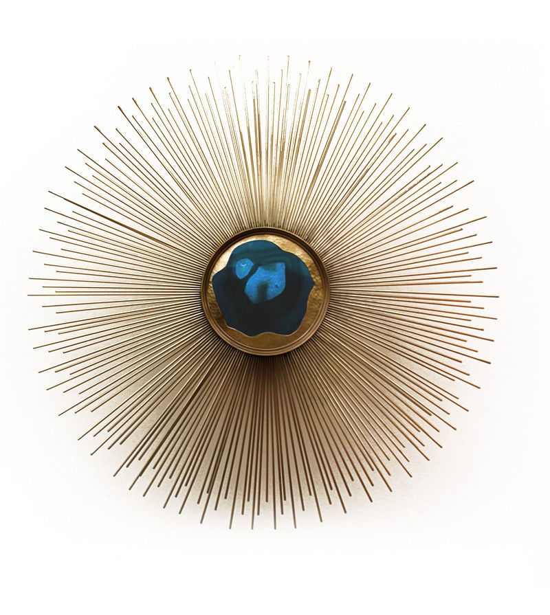
Lapis Blue

“Lapis Blue has an inner richness that is not seen in Niagara, making it a bolder and more confident color. This is a stunning shade can give a dramatic yet chic touch to rooms.”


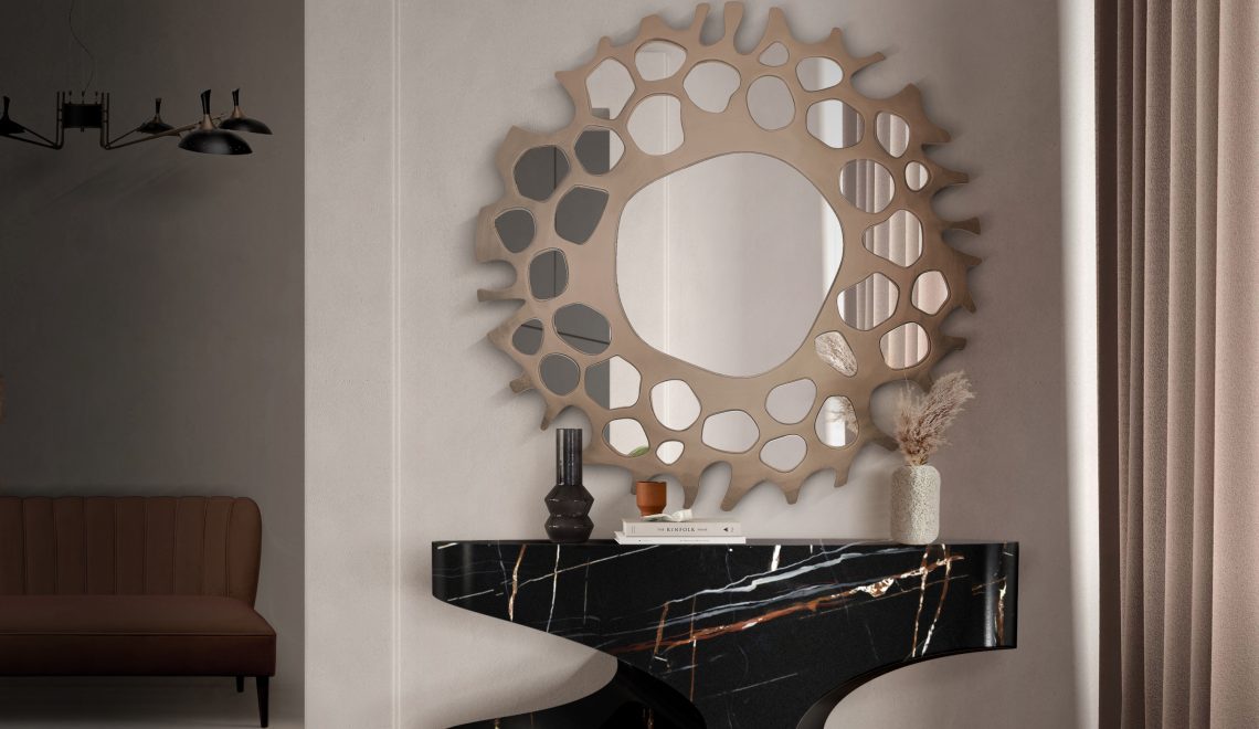
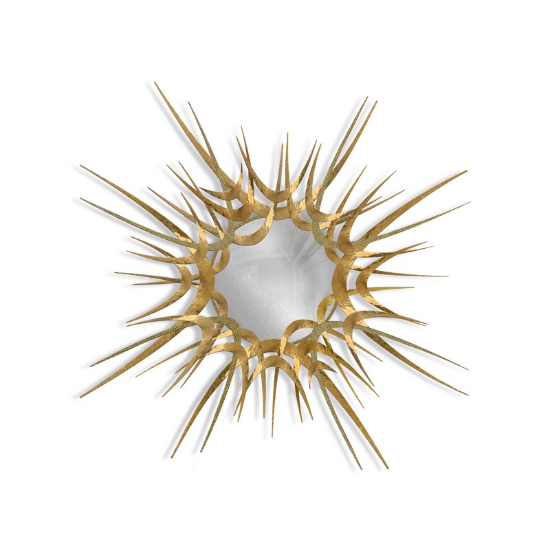
Related Article: iSaloni 2017 – Contemplate Boca do Lobo’s Maximalist Wall Mirrors
Flame

“Flame is the only orange-toned color predicted for Spring. Flamboyant and vivacious, this orange-red hue is great for brightening up darker spaces or adding a fiery pop of color.”

Island Paradise

“A refreshing aqua blue, Island Paradise evokes tropical settings and dreamy days. Wonderful as an accent or all over color, the cool blue green hue is invigorating yet calming. Although vibrant, this due can be applied to walls, accents and upholstery.”
Pale Dogwood

“Pale Dogwood is the softer offspring of Rose Quartz. This peaceful shade carries an essence of purity and innocence like a newborn baby. A beautiful subtle hue, the soft pink looks stunning on walls and upholstery pieces.”

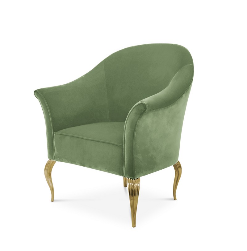
Greenery

“Not surprisingly, this tangy yellow-green is reminiscent of fresh foliage and the various green hues throughout nature. Although lighter and brighter, Greenery reminds one to take a deep breath, oxygenate and reinvigorate.”


Related Article: Outstanding Standing Floor Mirrors for a Sparkling Living Room Set
Pink Yarrow
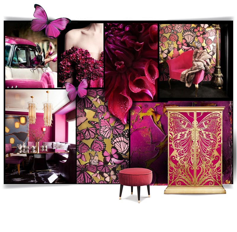
“Probably the most vibrant color of the bunch, Pink Yarrow is a bold and tantalizing hue that grabs attention. Hard to ignore, this color packs a playful punch and is great as a statement color.”

Kale
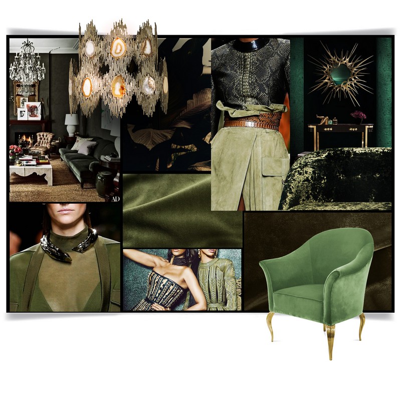
“Now you can eat it while gazing at the color on your walls! Kale is another foliage-based green that conjures up desires to connect to nature. This color is neutral enough to use all over or as an accent.”
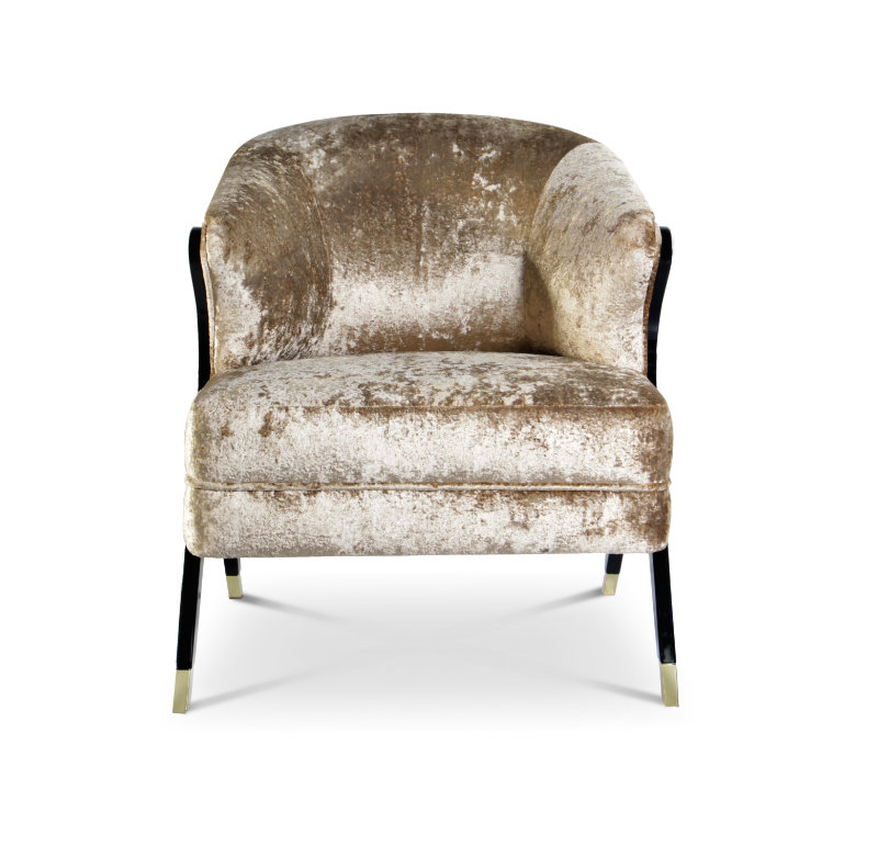
Hazelnut
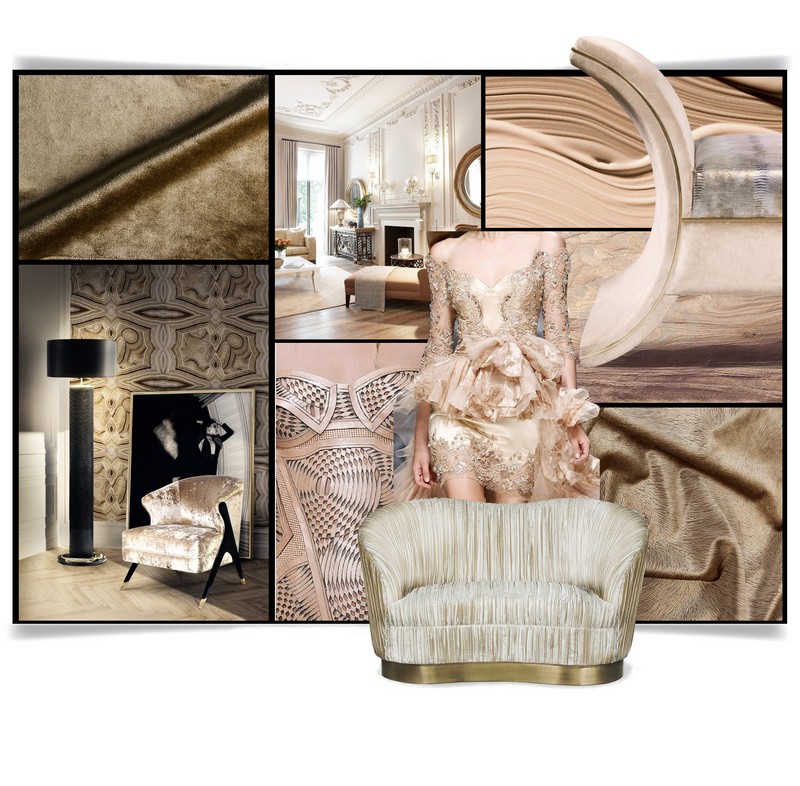
“Balancing out the rest of the hues is neutral Hazelnut. A light, warm brown, this shade brings to mind a natural earthiness like the nut itself. It’s a great transitional color to carry you throughout the seasons. Very gentle and glamorous at the same time.”

Feel free to share your thoughts on this article about colour trends. If you want to be up to date with the best news about trends, interior design tips, and furniture luxury brands, sign up to our Newsletter and receive in your email, free of charges, the latest and the most exclusive content from Wall Mirrors. Follow us on social networks: FACEBOOK | PINTEREST |TWITTER